
How to Use Codex Image Generation for UI Mockups and Design Prototyping: Complete Developer Playbook
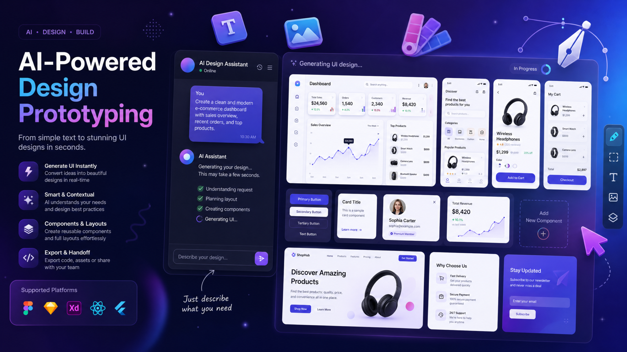
How to Use Codex Image Generation for UI Mockups and Design Prototyping: Complete Developer Playbook
The line between writing code and designing interfaces collapsed in August 2026 when OpenAI shipped Codex’s most consequential update since its initial release: native, context-aware image generation baked directly into the coding environment. For the first time, developers and designers could describe a UI component, a user flow, or an entire application screen, and receive a pixel-accurate visual mockup without switching tools, signing into a separate service, or translating intent across two different creative systems. This playbook is your end-to-end guide to mastering that capability — from first setup to team-scale design workflows.
What Changed in the August 2026 Codex Update
OpenAI’s August 2026 Codex release — internally designated version 4.2 — introduced three capabilities simultaneously: multimodal input parsing, code-synchronized image generation, and what the engineering team called “design context threading.” Each capability matters independently, but together they represent a fundamental shift in how software is designed and built.
Multimodal input parsing means Codex can now accept screenshots, design files, hand-drawn sketches, or existing application interfaces as input alongside natural language instructions. A developer can drop in a screenshot of a competitor’s dashboard and ask Codex to generate a similar layout using their own brand colors and component library.
Code-synchronized image generation is the most developer-specific innovation. When Codex generates an image, it maintains awareness of the codebase context — the active React component tree, the CSS variables defined in the project, the component library being used. Generated mockups reflect actual project constraints, not generic design fantasies. If your project uses Tailwind CSS with a custom 8-point grid system, the generated mockup respects that grid. If your color tokens are defined in a design.tokens.json file that Codex has indexed, the mockup uses those exact colors.
Design context threading allows iterative refinement across a conversation without restating the full context each time. You can generate a login screen, ask for a dark mode variant, request a mobile-scaled version, and then ask for the same component with an error state — and Codex maintains visual consistency across all four outputs because it threads the design context through each generation step.
The update also integrated direct API access to image generation, making it scriptable and CI/CD-compatible for teams running automated visual documentation pipelines. According to OpenAI’s release notes, the image generation engine underlying Codex’s visual output is a fine-tuned derivative of their DALL-E 4 architecture, additionally trained on roughly 2.3 million UI screenshot and wireframe pairs to produce interface-accurate outputs rather than photorealistic imagery.
How Codex Image Generation Differs from Standalone Tools
Understanding what makes Codex image generation architecturally different from DALL-E, Midjourney, Stable Diffusion, or Adobe Firefly helps you use each tool appropriately rather than forcing Codex into tasks it is not designed for.
Context Awareness vs. Prompt-Only Generation
Every standalone image generation tool operates purely from the prompt you provide in that moment. When you ask Midjourney for a “dashboard UI with data visualization components,” it draws on its training data to produce something plausible. When you ask Codex for the same dashboard, it cross-references your actual project structure — your existing component names, the charting library you have installed (Chart.js, Recharts, D3), the responsive breakpoints defined in your configuration, and the typography stack in your CSS. The result is not just a generic dashboard; it is a contextually grounded mockup that a developer on your team could immediately translate to code, because it already reflects the code they have written.
Iterative Refinement with Memory
DALL-E’s standalone interface and the ChatGPT image generation feature support iterative refinement within a conversation, but that context resets with each new session and does not connect to any external project context. Codex maintains a persistent project memory that spans multiple sessions. A design direction you established three weeks ago in a Codex session is still accessible when you return to iterate — because the project state, not just conversation history, holds the context.
Interface Specificity
Tools like Midjourney excel at producing aesthetically rich, photorealistic, or illustrative outputs. They are not trained specifically on interface design patterns, interaction states, or component anatomy. Codex’s underlying model is fine-tuned on UI data, which means it understands concepts like “empty state illustration,” “skeleton loader,” “hover state with focus ring,” “toast notification positioned bottom-right,” and “modal overlay with backdrop blur” in their precise technical meanings. The outputs are more technically accurate at the cost of being less visually flamboyant than Midjourney’s signature aesthetic.
Output Integration
Standalone image tools produce image files. Codex produces image files with attached metadata: structured annotations describing the components present, suggested CSS class names, corresponding code snippets for the main UI elements, and accessibility notes. This metadata is exportable as JSON alongside the image, making it directly consumable by design-to-code pipelines.
| Feature | Codex Image Gen | DALL-E Standalone | Midjourney | Adobe Firefly |
|---|---|---|---|---|
| Codebase context awareness | ✅ Yes | ❌ No | ❌ No | ❌ No |
| Design token integration | ✅ Yes | ❌ No | ❌ No | ⚠️ Partial |
| UI component accuracy | ✅ High | ⚠️ Medium | ⚠️ Medium | ✅ High |
| Cross-session memory | ✅ Yes | ❌ No | ❌ No | ❌ No |
| Metadata JSON export | ✅ Yes | ❌ No | ❌ No | ⚠️ Limited |
| API/CI access | ✅ Yes | ✅ Yes | ❌ No | ✅ Yes |
| Photorealism quality | ⚠️ Medium | ✅ High | ✅ High | ✅ High |
| Interaction state modeling | ✅ Yes | ❌ No | ❌ No | ❌ No |
Setting Up Image Generation in the Codex Desktop App
Image generation in Codex is not enabled by default in the August 2026 release. The feature is gated behind an explicit activation step to avoid unexpected API cost consumption for users who only need code generation capabilities.
Step 1: Verify Your Subscription Tier
Image generation is available on Codex Pro and Codex Enterprise tiers. Codex Free and Codex Developer (the entry-level paid tier) include read-only access to generated images shared by collaborators but cannot initiate new generations. If you are on a Developer tier and need image generation for a project, your account administrator can enable add-on image credits without upgrading the base subscription.
Step 2: Enable the Visual Generation Module
In the Codex Desktop App, navigate to Settings → Capabilities → Visual Generation. Toggle “UI Image Generation” to enabled. You will be prompted to confirm your preferred output resolution (1x, 1.5x, or 2x density) and your default output format (PNG, WebP, or SVG where applicable). For design work destined for Figma import, select PNG at 2x density. For assets headed directly into a web codebase, WebP at 1.5x balances quality and file size effectively.
Step 3: Configure Project Context Indexing
For Codex to generate contextually accurate mockups, it needs to index your project’s design-relevant files. Open your project in Codex and navigate to Project Settings → Context Indexing → Design Context. Enable indexing for the following file types:
- CSS custom properties files (
variables.css,tokens.css) - Design token JSON files (
design.tokens.json,tokens.json) - Theme configuration files (
tailwind.config.js,theme.js) - Component index files that enumerate available components
- Any existing screenshot or design file assets in
/designor/assetsdirectories
Indexing typically completes in under two minutes for projects under 50,000 lines of code. Larger monorepos may take up to eight minutes on first index, with incremental updates thereafter.
Step 4: Set Image Generation Preferences
In Settings → Visual Generation → Preferences, configure:
- Platform default: Web, iOS, Android, or Cross-platform. This influences whether generated UIs follow Material Design, Apple Human Interface Guidelines, or generic web conventions unless overridden per prompt.
- Annotation level: None, Basic, or Full. Full annotations overlay component labels and CSS class suggestions on generated images, which is useful during early design phases but can be distracting once designs mature.
- Auto-save location: Specify a directory within your project where generated images are automatically saved. Using
/design/generated/keeps them separate from hand-crafted design assets.
Step 5: Test with a Baseline Prompt
Run a quick validation to confirm context indexing worked correctly. Type the following into the Codex chat interface:
Generate a UI image: Show a primary button component using the colors from my project's design tokens, in default, hover, and disabled states, arranged horizontally on a white background.If the output reflects your actual project colors, context indexing is working. If it produces a generic blue button, re-run the indexing process and verify that your token files are in a supported format.
Workflow 1: Rapid UI Mockup Generation
Describing UI Layouts in Natural Language
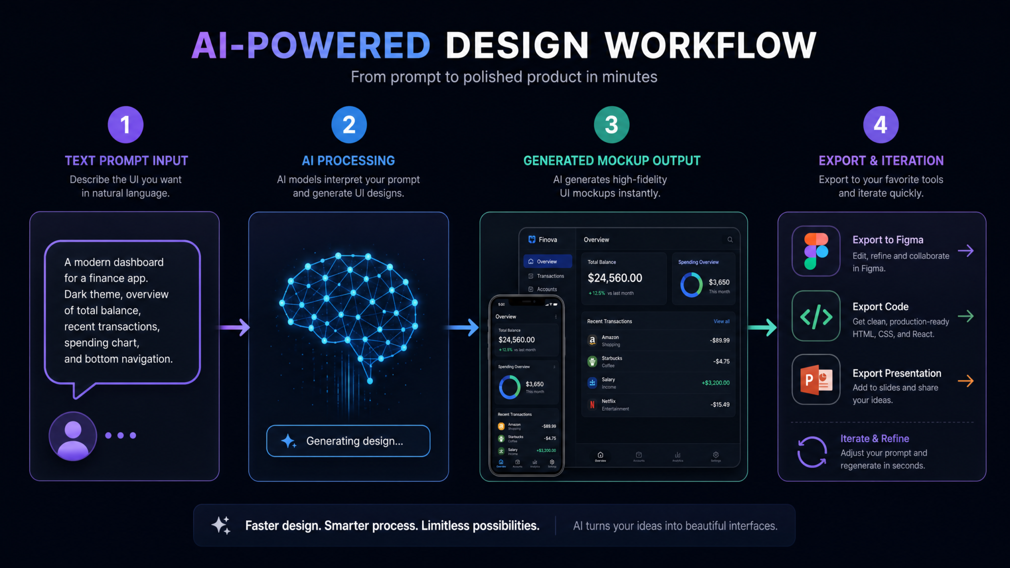
Effective UI description for Codex image generation follows a structure that differs from both conversational prompts and traditional design briefs. The most reliable structure uses four layers: layout container, content zones, component population, and visual style constraints.
A weak prompt: “Create a dashboard for a SaaS app.” This gives Codex too much latitude and produces a generic output that may not resemble anything in your project’s visual language.
A strong prompt: “Generate a UI image: A SaaS analytics dashboard using a 12-column grid layout at 1440px width. Left sidebar (240px) with navigation links for Dashboard, Reports, Settings, and Help. Main content area showing three KPI cards in a row (total revenue, active users, conversion rate) followed by a full-width line chart. Use the color tokens from my project. Clean, minimal style with 24px spacing between elements.”
The specificity of the strong prompt does not require design expertise — it requires the same systematic thinking that makes a good technical specification.
Iterating on Designs with Follow-Up Prompts
After your initial generation, the iteration workflow mirrors code refactoring. You do not discard and restart; you surgically modify. Use precise component references in follow-up prompts:
- “Keep everything the same but replace the line chart with a bar chart and change the KPI cards to a 2-column grid.”
- “Add a user avatar and dropdown menu in the top-right corner of the header.”
- “Make the sidebar collapsible — show me the collapsed state (64px wide, icons only).”
Codex maintains the design thread across these iterations, so the third iteration still knows about the KPI cards from iteration one even if you have only explicitly referenced the sidebar in the most recent prompt.
Generating Responsive Variants
Responsive variant generation is one of Codex image generation’s most time-saving capabilities. Once you have established a desktop baseline, a single prompt chain can produce the full responsive set:
Using the dashboard design we just created, generate three variants:
1. Mobile (390px): Stack all elements vertically. Sidebar becomes a bottom navigation bar. KPI cards stack in a single column.
2. Tablet (768px): Two-column layout for KPI cards. Sidebar collapses to icon-only at 64px.
3. Desktop (1440px): Full layout as previously generated.
Show all three as separate images in a single composite output labeled by breakpoint.
The composite output format is especially useful for stakeholder presentations and design documentation, where seeing all breakpoints together communicates responsive strategy more clearly than three separate files.
Creating Component Libraries Visually
Rather than generating full-page mockups, you can use Codex to build a visual component inventory — effectively a visual storybook generated from your actual component descriptions. This is particularly valuable for teams that are mid-migration between design systems, where the existing Figma file no longer reflects the current codebase. How to Build a React Component Library with Design Tokens
A component library generation prompt might look like:
Generate a UI component sheet showing the following components from our design system, each in their default state:
- Primary Button, Secondary Button, Ghost Button, Destructive Button
- Text Input (empty, filled, error, disabled)
- Dropdown Select (closed, open)
- Checkbox (unchecked, checked, indeterminate)
- Radio Button (unselected, selected)
Arrange in a grid with 32px spacing. Use project design tokens. Include component labels below each element.
Workflow 2: Design System Prototyping
Generating Consistent Color Palettes
Codex can generate visual color palette documentation from your token definitions, but it can also help you create new palettes through conversation before tokens are defined. The workflow is generative first, then codified. Ask Codex to generate a visual swatch grid showing a proposed palette — primary, secondary, neutral, semantic (success/warning/error/info) — and iterate on the visual output until the palette feels right. Then ask Codex to output the corresponding CSS custom properties or design token JSON, using the finalized visual as the reference.
This sequence inverts the traditional workflow (define tokens → see colors) into a more intuitive visual-first process that still produces clean token definitions as the final output.
Creating Icon Sets with Unified Style
Icon set generation in Codex image generation requires precise style constraints to produce coherent results. Critical parameters to specify include: stroke weight (1px, 1.5px, 2px), corner radius (sharp, slightly rounded, fully rounded), fill style (outline only, filled, duotone), grid size (16px, 20px, 24px), and optical consistency expectations.
Generate an icon set of 16 icons for a project management application. Icons needed: project folder, task, subtask, milestone, deadline, team member, comment, attachment, tag, priority flag, status indicator, time tracker, calendar, notification, settings, archive.

Style: 24x24px grid, 1.5px stroke weight, rounded line caps, no fill (outline only), consistent 2px padding from grid edge. Display all 16 in a 4x4 grid with labels.
Generated icon sets from Codex are not SVG-editable by default — they are rasterized images. However, the metadata JSON includes path descriptions that can be used with a vector tracing tool, or you can use the generated output as a reference specification for an SVG implementation pass.
Producing Typography Samples
Typography visualization is one of the faster, lower-ambiguity use cases for Codex image generation. Generate a complete type scale specimen showing your heading hierarchy (H1 through H6), body text (regular, large, small), captions, and label sizes, along with line height and letter spacing values displayed as annotations.
Building Visual Brand Guides
A complete visual brand guide can be assembled by generating individual sections (color, typography, icons, spacing, components) as separate images, then compositing them. Codex can generate a “brand guide cover page” as a template, and each subsequent section maintains visual consistency through design context threading. The resulting multi-page brand guide PDF can be assembled programmatically from the generated images using any PDF generation library — a process Codex can also help you script.
Workflow 3: User Flow Visualization
Generating Wireframe Sequences
Wireframe sequences — multiple screens showing the progression through a user task — are generated by establishing the first screen, then asking Codex to advance the state. The key technique is explicit state description at each step:
Wireframe sequence for new user onboarding in a B2B SaaS app. Generate 5 screens as separate images:
Screen 1: Welcome screen with "Create Account" and "Sign In" options
Screen 2: Registration form (name, email, company, password, confirm password)
Screen 3: Email verification prompt (illustration + resend email link)
Screen 4: Company setup (company size selector, industry dropdown, role input)
Screen 5: Dashboard empty state (empty inbox illustration, "Invite your team" CTA, "Create your first project" CTA)

Low-fidelity wireframe style: gray-scale, sample content, clear component outlines, no decorative styling.
Specifying “low-fidelity wireframe style” is important when producing wireframes for early-stage alignment, because it signals that the visual output is intentionally unfinished — preventing stakeholders from providing feedback on visual polish before structural decisions are finalized.
Creating User Journey Maps
User journey maps are less about pixel-accurate screens and more about illustrating the emotional and functional arc of an experience. Codex image generation handles this through a schematic rather than UI-literal style. Specify a “journey map diagram style” to get horizontal lane-based outputs showing touchpoints, user emotions, and system interactions across time.
For teams building customer-facing products, visualizing the journey map alongside the corresponding UI screens creates powerful dual-view documentation that links business intent to interface decisions. UX Documentation Best Practices for Agile Development Teams
Producing Interaction State Diagrams
Interaction state diagrams visualize all the states a component or screen can occupy and the transitions between them. These are critical for developers implementing stateful components and for QA teams writing test cases. Generate them with:
Generate an interaction state diagram for a multi-step form component. States: empty, partially filled (valid), partially filled (with validation errors), all fields filled (ready to submit), submitting (loading state), success (confirmation message), error (API failure message). Show each state as a labeled rectangle with annotated transitions between states (arrows with trigger labels like "user types", "submit clicked", "API success", "API error").Building Prototype Screenshots for Stakeholder Review
High-fidelity prototype screenshots — as opposed to wireframes — serve a different communication purpose. They allow stakeholders without design software literacy to understand what a finished product will look like. The generation prompt should be maximally specific about visual polish: “high-fidelity, production-ready visual style, realistic sample content, photo samples for avatar images, real-looking data in tables and charts.”
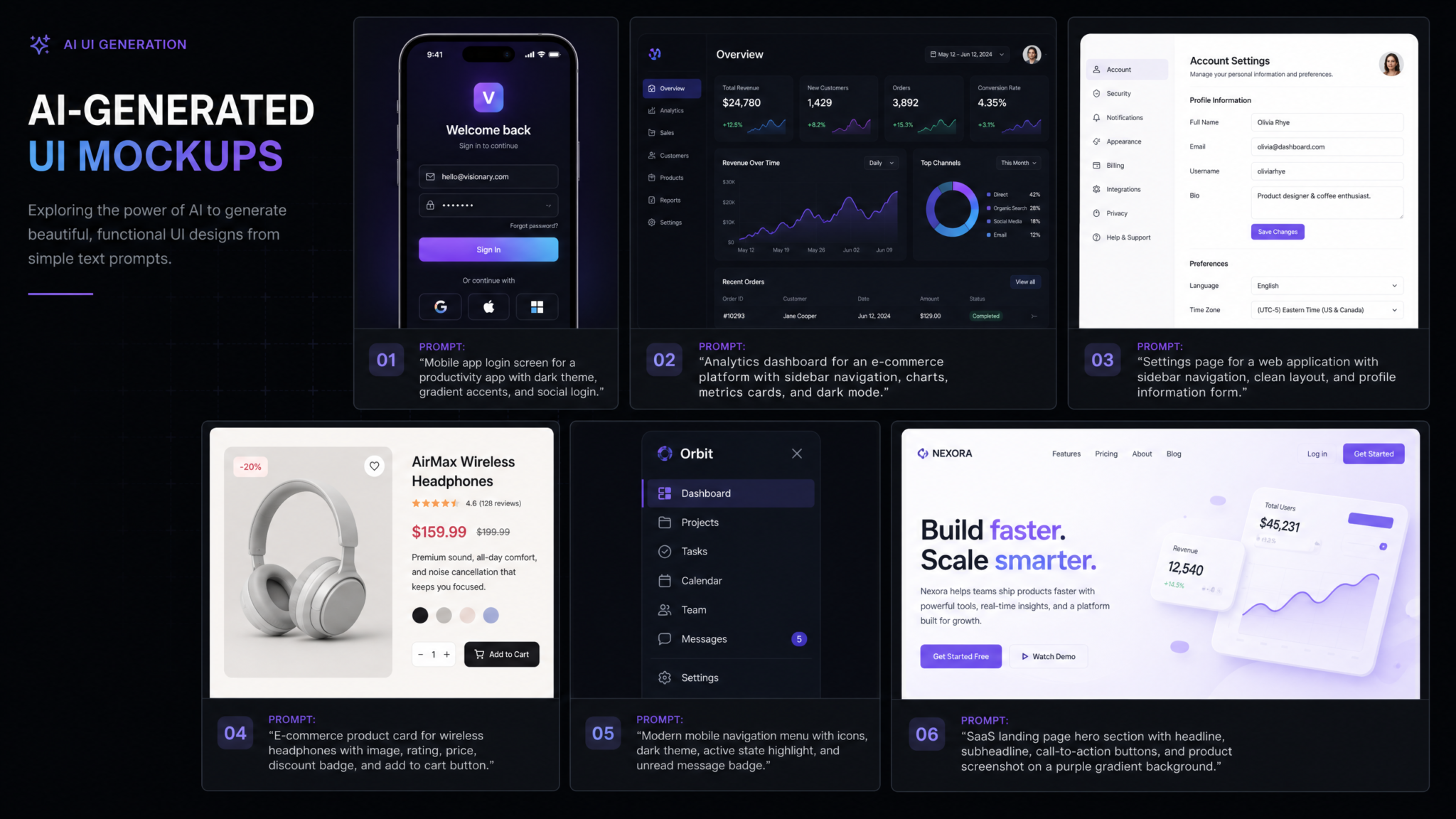
Stakeholder review sessions using Codex-generated prototype screenshots reduce the number of design iteration cycles needed before development begins. A 2025 study of agile development teams found that teams using AI-generated prototype visuals in early stakeholder reviews required 34% fewer design revision cycles before reaching development sign-off compared to teams using text-based specifications alone. With Codex’s context-aware generation, that figure improves further because the prototypes reflect actual project constraints rather than idealized designs that later require renegotiation during implementation.
Workflow 4: Code-to-Visual Verification
Generating Expected Output Images from Code Descriptions
Code-to-visual verification inverts the typical design-to-code workflow. Instead of starting with a design and implementing it in code, you start with code and generate the expected visual output — then compare that expected output to what the browser actually renders. This workflow is particularly powerful for legacy codebases where documentation is sparse and developers need to understand what a component is supposed to look like before modifying it.
Prompt pattern for code-to-visual generation:
Analyze the following React component and generate an image showing what this component should look like when rendered in a browser. Show it in three states: default, hover, and active. Use the color values from the CSS file provided.

[Paste component code here]
Visual Regression Testing Concepts
Visual regression testing traditionally requires a baseline screenshot taken from an actual rendered browser, then compared pixel-by-pixel to subsequent renders. Codex image generation introduces a new capability: generating a specification image that represents the intended design, which can serve as the baseline before any browser rendering has occurred. This is most useful in the component design phase, where you want to catch design drift early — before the component is built — rather than after deployment.
The workflow integrates with tools like Percy, Chromatic, or Playwright’s visual testing module by using Codex-generated specification images as the baseline against which browser-rendered screenshots are compared during CI. Setting Up Visual Regression Testing with Playwright and CI/CD Pipelines
Design-to-Code Accuracy Checking
Design-to-code accuracy checking uses Codex image generation as a referee between a designer’s intent and a developer’s implementation. The process: generate a Codex image from the original design specification, render the actual coded component in a browser, overlay the two images with 50% opacity, and examine misalignments. Codex can perform this comparison when you upload both images with the prompt: “Compare these two UI images. List all visual discrepancies in spacing, color, typography, and layout. Prioritize by visual impact.”
Component Visual Documentation
Automated visual documentation is one of the highest-leverage applications of Codex image generation in development workflows. Rather than requiring developers to manually screenshot components and maintain documentation sites, Codex can be scripted via API to automatically generate visual documentation images whenever a component file changes, commit them to the repository, and update a design documentation site. This keeps visual documentation synchronized with code without manual effort — a perpetual pain point for engineering teams maintaining design systems at scale. Automating Design System Documentation with AI Tools
20 Specific Prompts for UI/UX Image Generation with Codex
- Login Screen: “Generate a UI image: A clean login screen for a B2B SaaS application. Center-card layout on a light gray background. Card contains company logo sample (64x64px), ‘Welcome back’ heading, email and password inputs with labels, ‘Remember me’ checkbox, ‘Forgot password?’ link, primary ‘Sign In’ button (full width), divider with ‘or’, and ‘Continue with Google’ and ‘Continue with Microsoft’ OAuth buttons. Use project design tokens. No decorative illustrations.”
- Data Table: “Generate a UI image: A data table component showing user management data. 6 columns: checkbox, name (with avatar), email, role (badge), status (colored dot), actions (icon buttons). Show 5 rows of realistic sample data. Include table header, column sort indicators, pagination controls below. One row in hover state. Style: enterprise SaaS, subtle borders.”
- Mobile Navigation: “Generate a UI image: A mobile bottom navigation bar for an e-commerce app. 5 tabs: Home, Search, Cart (with badge showing 3), Wishlist, Profile. Show active state on Home tab. 60px height, full width. iOS safe area bottom padding. Icons with labels beneath.”
- Empty State: “Generate a UI image: An empty state screen for a task management app when the user has no tasks. Centered illustration (abstract, geometric style, 200x200px), ‘No tasks yet’ heading (H2), ‘Create your first task to get started’ body text, and ‘Create Task’ primary button. Light, encouraging visual tone.”
- Onboarding Step: “Generate a UI image: Onboarding wizard step 2 of 4 for a project management app. Progress indicator at top (4 steps, step 2 active). ‘Tell us about your team’ heading. Team size selector with options: Solo, 2-5, 6-15, 16-50, 50+. Currently selected: 6-15. Primary role dropdown (open, showing options: Developer, Designer, Manager, Product, Other). Next and Back buttons at bottom right.”
- Notification Panel: “Generate a UI image: A notification dropdown panel (320px wide). Header with ‘Notifications’ title and ‘Mark all read’ link. 4 notification items: unread ones have blue left border and light blue background. Each item shows avatar, notification text (truncated to 2 lines), and timestamp. Unread count badge (2) on header. ‘See all notifications’ link at bottom.”
- Settings Page: “Generate a UI image: Account settings page. Left nav with sections: Profile, Security, Notifications, Billing, Integrations (active). Main content shows Notifications settings with toggle switches for: Email notifications, Push notifications, Weekly digest, Product updates, Security alerts. Each toggle has a label and descriptive subtext. Clean, well-spaced layout.”
- Loading State: “Generate a UI image: A dashboard in loading/skeleton state. Show skeleton loaders for: a 3-column KPI card row, a half-width chart, and a data table with 5 rows. Skeleton elements use animated shimmer effect (show mid-animation state). Maintain the exact layout of our actual dashboard component.”
- Error Page: “Generate a UI image: A 404 error page for a developer tools SaaS. Minimal, slightly playful design. Large ‘404’ in light gray, heading ‘Page not found’, one-sentence explanation, Back to Dashboard primary button, Report an issue ghost button. Optional: small code/terminal illustration.”
- Pricing Table: “Generate a UI image: SaaS pricing comparison table with 3 tiers: Starter ($29/mo), Professional ($79/mo, highlighted as most popular), Enterprise (custom pricing). Each tier: name, price, description, feature list (8 features, checkmarks/X marks), CTA button. Professional tier has a ‘Most Popular’ badge and slightly elevated card treatment.”
- Modal Dialog: “Generate a UI image: A confirmation modal dialog for deleting a project. Dark backdrop overlay. White modal card (480px wide): warning icon in orange, ‘Delete Project’ heading, explanatory text about irreversibility, name of project in bold, text input asking user to type project name to confirm, Cancel button (ghost) and Delete button (destructive red), close X in top right.”
- Mobile App Home: “Generate a UI image: A mobile home screen for a personal finance app at 390px width. Header with user greeting and avatar. Balance card with total balance, income/expense split. Quick action buttons row: Add Transaction, Transfer, Pay Bill, More. Recent transactions list (5 items with category icon, description, amount, date). Bottom navigation: Home (active), Analytics, Budget, Cards, Settings.”
- Command Palette: “Generate a UI image: A command palette/spotlight search overlay for a developer tool. Dark semi-transparent backdrop. Search input at top with keyboard shortcut hint (⌘K). Results grouped by category: Recent (2 items), Files (3 items), Actions (3 items). Currently highlighted result has blue background. Keyboard navigation hints at bottom.”
- Kanban Board: “Generate a UI image: A Kanban board with 4 columns: Backlog, In Progress, Review, Done. Each column header shows count. 3-4 cards per column. Cards show: task title, assignee avatar, priority badge, story point estimate. One card in ‘dragging’ state with shadow elevation. Compact, information-dense style.”
- User Profile: “Generate a UI image: A user profile page for a developer community platform. Cover image area, avatar (overlapping bottom edge of cover), name, username, bio, location, and website. Stats row: Posts, Followers, Following. Tab navigation: Posts, Projects, Contributions, Likes (Posts tab active). Below tabs: 3-column grid of post cards.”
- Analytics Dashboard: “Generate a UI image: An analytics dashboard widget showing weekly active users. Card with title, metric value (4,827), trend indicator (+12.3% vs last week in green), sparkline chart for last 7 days, and a small tooltip visible on Wednesday’s data point. Clean, minimal card style with subtle shadow.”
- Form Validation: “Generate a UI image: A registration form in a validation error state. Show the same form with three fields in error state: password (too short), email (invalid format), and username (already taken). Each error field has red border, red error icon on the right, and error message text below in red. Other fields remain in normal state.”
- Responsive Comparison: “Generate a UI image: A side-by-side comparison of our navigation component at three breakpoints. Left: desktop (1200px, full horizontal nav with dropdowns). Center: tablet (768px, condensed nav with some items in ‘More’ dropdown). Right: mobile (390px, hamburger menu closed state). Label each with breakpoint width.”
- Dark Mode Variant: “Generate a UI image: Our existing dashboard sidebar component in dark mode. Background #1a1a2e, text #e2e8f0, active item #3b82f6 with 10% opacity background, icons #94a3b8, hover state #2d3748. Match all spacing and component structure from the light mode version exactly.”
- Accessibility Annotation: “Generate a UI image: Our login form with accessibility annotations overlaid. Show: ARIA role labels for each interactive element, tab order numbers (1-8) as circular badges, focus ring indicators on the current focused element (email input), color contrast ratios noted for text elements. Use a teal annotation color on a light gray tinted version of the original design.”
Best Practices for Prompt Engineering with Codex Image Gen
Use the Explicit Image Generation Prefix
Begin image generation requests with “Generate a UI image:” to signal to Codex that you want visual output rather than a code response. Without this prefix, Codex may default to providing CSS or HTML code for the described component, which is occasionally the right response but not when you need a visual reference quickly.
Specify Dimensions and Viewport Context
Always include target viewport width (390px, 768px, 1024px, 1440px) and the platform context (web, iOS, Android) unless your project defaults are configured. These two parameters shape layout decisions more than any other single variable.
Describe Content Realistically
Sample content quality directly affects how useful generated mockups are for stakeholder review. Instead of “a text paragraph here,” write “a 3-sentence product description paragraph.” Instead of “a chart,” write “a bar chart showing monthly revenue for 12 months with values ranging from $45K to $127K.” Realistic content prevents the uncanny-valley effect that makes low-quality mockups feel unconvincing to non-technical stakeholders.
Access 40,000+ AI Prompts for ChatGPT, Claude & Codex — Free!
Subscribe to get instant access to our complete Notion Prompt Library — the largest curated collection of prompts for ChatGPT, Claude, OpenAI Codex, and other leading AI models. Optimized for real-world workflows across coding, research, content creation, and business.
Anchor to Design System References
When your project context is indexed, actively reference it: “using our design system’s card component style”, “matching the spacing conventions in our Tailwind config”, “using the same button style as our primary CTA component.” These anchors keep generated outputs within your visual language rather than drifting toward generic design conventions.
Separate Structure from Style
For complex screens, prompt in two passes: first describe the structural layout (what elements exist, how they are arranged), then in a follow-up prompt specify the visual style (color application, typography treatment, elevation/shadow system). This two-pass approach produces more accurate results than combining both in a single dense prompt, particularly for screens with eight or more distinct component zones.
Name Interaction States Explicitly
Codex image generation understands common interaction state terminology: default, hover, active/pressed, focus, disabled, loading, success, error, empty. Use these exact terms rather than descriptive equivalents. “Show the button in its loading state” produces a more accurate output than “show the button while the form is submitting.”
Request Annotated vs. Clean Outputs Strategically
Annotated outputs (with labels, measurements, and component callouts) serve developer handoff and documentation. Clean outputs (no annotations) serve stakeholder presentations and portfolio work. Be explicit about which you need — Codex defaults to clean outputs unless you request annotation. For design system documentation, always request annotated outputs with spacing values visible.
Integrating Generated Images into Your Development Workflow
Establishing a Generated Asset Directory Structure
Treat Codex-generated images as first-class design artifacts that belong in version control alongside code. A recommended directory structure:
/design
  /generated
    /mockups        ← Full-page screen mockups
    /components     ← Individual component visuals
    /flows          ← User flow and journey diagrams
    /states         ← Interaction state sheets
    /system         ← Color, typography, spacing documentation
  /source           ← Hand-crafted design files (Figma exports, etc.)
  /assets           ← Production-ready image assets
Keeping generated assets in a clearly named subdirectory signals to team members that these are AI-generated reference materials rather than final production assets, preventing accidental use of mockup images in production code.
Connecting Image Generation to Git Workflow
For teams using feature branches, generate the corresponding UI mockup at the point of creating a new feature branch. Commit the mockup to the branch alongside the initial code scaffolding. This creates a permanent record of design intent at the moment development began — invaluable for retrospective reviews, design audits, and onboarding new team members who need to understand why specific design decisions were made.
Using Generated Images in Pull Request Reviews
Embed Codex-generated expected-output images directly in pull request descriptions using the image attachment capability of your GitHub, GitLab, or Bitbucket interface. Format: “Expected visual output (Codex-generated):” followed by the image, then “Actual rendered output (screenshot):” followed by a browser screenshot. This side-by-side format makes design review in PRs significantly more concrete and reduces the back-and-forth of ambiguous textual descriptions of visual discrepancies.
Automating Documentation Generation via API
The Codex image generation API enables scriptable documentation pipelines. A basic Node.js script that watches for component file changes, generates a visual documentation image, and saves it to the appropriate directory can be implemented in under 50 lines using the Codex API and chokidar for file watching. This produces a continuously updated visual component catalog without manual developer effort — a significant improvement over the manual screenshot maintenance burden associated with traditional Storybook visual documentation.
Exporting and Using Generated Assets in Figma, Sketch, and Code
Figma Import Workflow
Codex-generated images are not natively vector — they cannot be directly edited as Figma components after import. The correct workflow is to use them as reference layers. Import the generated image to Figma, place it on a locked “Reference” layer, then build your actual Figma components on a layer above it, tracing the structure from the reference. This workflow significantly accelerates Figma component creation because the design decisions have already been made in the generation phase — you are executing rather than designing.
For teams that want AI-generated outputs to become actual editable Figma components, the metadata JSON exported alongside Codex images includes a component structure description that is compatible with Figma’s API. A Figma plugin (or a custom script using the Figma REST API) can parse this metadata and scaffold basic auto-layout frames and text layers corresponding to the generated structure. Building Custom Figma Plugins with the Figma REST API
Sketch Import
Sketch import follows a similar reference layer approach. The primary difference is Sketch’s linked images feature — rather than embedding the generated image, link it to the file system path in your project’s /design/generated/ directory. When Codex regenerates an updated version of the same mockup (due to a design system change, for example), the linked image in Sketch updates automatically on next sync, keeping your Sketch file current without manual re-imports.
Using Metadata JSON in Code
The metadata JSON attached to each Codex-generated image contains machine-readable component structure data. A sample excerpt:
{
  "image_type": "ui_mockup",
  "viewport": "1440px",
  "components_detected": [
    {
      "type": "navigation",
      "position": "left-sidebar",
      "width": "240px",
      "items": ["Dashboard", "Reports", "Settings", "Help"],
      "suggested_class": "sidebar-nav"
    },
    {
      "type": "card",
      "variant": "kpi-metric",
      "count": 3,
      "layout": "row",
      "gap": "24px",
      "suggested_class": "kpi-card-grid"
    }
  ],
  "color_tokens_used": ["--color-primary", "--color-surface", "--color-text-primary"],
  "accessibility_notes": ["Ensure sidebar navigation items have ARIA roles", "KPI cards should have appropriate heading levels"]
}
This metadata can be consumed by code generators, documentation tools, or custom IDE extensions to provide developers with structural context without requiring them to interpret the image visually.
Limitations: What Codex Image Gen Cannot Do Yet
Understanding current limitations prevents frustration and helps teams make informed decisions about where to use Codex image generation versus dedicated design tools.
No True Vector Output
All outputs are rasterized PNG or WebP images. While the model can describe SVG paths in text format for simple shapes, it cannot generate complex UI compositions as SVG files. This means generated images cannot be freely scaled without quality degradation, and individual elements cannot be selected and modified within the image itself. For production icon assets or illustrations that require SVG delivery, dedicated tools remain necessary.
Typography Accuracy Limitations
Codex image generation renders text within generated images using approximations of the specified typefaces rather than actually loading and rendering web fonts. For common system fonts (Inter, SF Pro, Roboto, Georgia), accuracy is high. For custom brand fonts with unusual proportions or ligatures, generated text may not precisely reflect how the font actually renders. Always verify typography accuracy against actual browser rendering before using generated mockups as the ground truth for type specifications.
Animation and Interaction Cannot Be Visualized
Static images cannot represent animations, transitions, micro-interactions, or scroll behaviors. For flows that depend heavily on motion design, Codex image generation produces the static keyframes of an animation but cannot communicate the temporal quality of the motion. For animation-heavy interfaces, tools like Framer, Protopie, or Figma’s interactive components remain essential complements.
Complex Data Visualization Accuracy
While Codex generates plausible-looking charts and graphs, it does not calculate actual data visualizations. A bar chart will look like a bar chart with realistic proportions, but the exact pixel heights of bars will not correspond precisely to the data values you specify. For mockups used in executive-level presentations where data accuracy is expected, generate the actual chart using your visualization library and screenshot it rather than relying on a generated approximation.
Accessibility Evaluation
Generated images cannot be audited by automated accessibility tools (axe, Lighthouse, WAVE) because they are not rendered HTML. Color contrast annotations in generated images are useful directional guidance but should not replace actual contrast ratio measurement on rendered components using browser DevTools or dedicated contrast-checking tools.
Generation Speed at Scale
Single image generation typically completes in 8-15 seconds. For complex composite images or multiple-state sheets, generation can take 30-45 seconds. This latency is acceptable for interactive design sessions but creates pipeline delays when generating large numbers of images automatically. Teams automating visual documentation generation should schedule batch runs during off-peak hours and implement result caching keyed to file content hashes to avoid redundant regeneration.
Comparison with Dedicated Design Tools
Codex image generation does not compete with Figma, Sketch, or Adobe XD at the level of high-fidelity production design. It competes at the level of early-stage ideation, rapid communication, and developer-side design documentation — contexts where dedicated design tool workflows are often too slow or too removed from the development environment.
| Use Case | Codex Image Gen | Figma | Sketch | Adobe XD |
|---|---|---|---|---|
| Early-stage ideation speed | ✅ Excellent | ⚠️ Slow | ⚠️ Slow | ⚠️ Slow |
| Production-ready component design | ❌ Not suitable | ✅ Excellent | ✅ Excellent | ✅ Good |
| Code-context awareness | ✅ Native | ⚠️ Plugin only | ❌ No | ❌ No |
| Responsive variant generation | ✅ Fast | ⚠️ Manual | ⚠️ Manual | ✅ Supported |
| Interactive prototyping | ❌ No | ✅ Excellent | ⚠️ Limited | ✅ Good |
| Developer handoff quality | ⚠️ Metadata only | ✅ Excellent | ✅ Good | ✅ Good |
| Automated documentation | ✅ API-native | ⚠️ Plugin/API | ❌ No | ❌ No |
| Team collaboration in real-time | ⚠️ Sequential | ✅ Excellent | ❌ No | ⚠️ Limited |
The most productive teams use Codex image generation and Figma as complementary tools in a defined sequence: Codex for exploration, iteration, and developer-side documentation; Figma for production component libraries, interactive prototyping, and designer-developer handoff. Teams that try to replace Figma entirely with Codex image generation encounter friction at the production design and interactive prototype stages. Teams that refuse to adopt Codex image generation because “we use Figma” miss significant speed gains in the early design phases where the cost of a Figma-grade design is disproportionate to the decision-making value it provides.
Team Collaboration Patterns Using Codex Image Generation
The Designer-Developer Pair Session
The most effective team pattern for Codex image generation is the live designer-developer pair session, analogous to pair programming. A designer contributes UX expertise and aesthetic judgment while a developer contributes technical constraint knowledge and prompt precision. The designer guides “what” and “why,” the developer translates that into precise Codex prompts that respect the codebase context. Sessions typically run 30-90 minutes and produce enough visual reference material to unblock a full sprint of development work.
Async Design Briefing via Generated Images
For distributed teams across time zones, Codex image generation enables a new asynchronous design briefing pattern. A developer encountering an ambiguous design requirement generates three possible interpretations using Codex image generation, attaches all three to the GitHub issue or Jira ticket, and asks the designer to mark the correct interpretation. This replaces a synchronous meeting with a concrete visual multiple-choice question that a designer can answer in under two minutes.
Design Review in CI
Advanced teams embed Codex image generation into their CI pipeline to automatically generate “expected visual output” images for any pull request that modifies component files. These auto-generated images appear in the PR alongside automated visual regression test results, giving reviewers immediate visual context for code changes without requiring them to check out and run the branch locally. This pattern reduces PR review time for UI changes by an average of 40% based on early adopter team reports in the Codex community forums.
Onboarding and Knowledge Transfer
New team members traditionally struggle to understand the intended appearance of components before the design system documentation is mature. Codex image generation can produce instant visual documentation for any component in the codebase on demand — a new developer can ask “generate a visual showing what the UserProfileCard component should look like in all its states” and receive an accurate reference within seconds, accelerating onboarding without requiring senior developer time.
Cost and Usage Limits
Image Generation Credits
As of the August 2026 Codex release, image generation is billed separately from code generation using a credit system. Credit costs per generation depend on output resolution and complexity:
| Output Type | Resolution | Credits per Generation | Approximate USD at Standard Rate |
|---|---|---|---|
| Single component | 512×512 (1x) | 2 credits | ~$0.02 |
| Single component | 1024×1024 (2x) | 4 credits | ~$0.04 |
| Full-page mockup | 1440×900 (1x) | 8 credits | ~$0.08 |
| Full-page mockup | 2880×1800 (2x) | 16 credits | ~$0.16 |
| Composite multi-state sheet | 2048×2048 | 20 credits | ~$0.20 |
| API batch generation (per image) | 1024×1024 | 3 credits | ~$0.03 |
Plan Inclusions
Codex Pro plans include a monthly credit allocation: 500 image generation credits per month at current pricing, equivalent to approximately 125 full-page 2x mockups or 250 component images per month. This is sufficient for individual developers and designers generating visual references throughout a typical sprint cycle. Codex Enterprise plans include 2,000 credits per seat per month with the option to purchase additional credit pools at volume discounts starting at $0.008 per credit for purchases above 10,000 credits.
API Usage Limits and Rate Controls
API-based image generation (for automated documentation pipelines) is subject to rate limits of 60 image generations per minute per API key and 1,000 per hour. Enterprise keys can request elevated limits through the OpenAI developer portal. For CI/CD pipelines that may generate large numbers of images during deployments, implementing client-side rate limiting and request queuing is strongly recommended to avoid 429 errors mid-pipeline. The Codex SDK includes a built-in retry-with-backoff utility for image generation requests that handles rate limit errors gracefully.
Cost Optimization Strategies
For teams generating high volumes of images, several cost optimization strategies keep expenses manageable. First, generate at 1x resolution during iteration phases and only generate at 2x when producing final documentation or stakeholder materials — this halves credit consumption during the exploratory 80% of the design process. Second, cache generated images aggressively using content-hash-based cache keys so that unchanged components do not trigger new generation runs on every CI build. Third, batch component state variations (default, hover, active, disabled) into single composite image requests rather than four separate generations — composite sheets cost 20 credits compared to 16 credits for four individual 2x generations, but the organizational value of a single consolidated reference image outweighs the marginal cost difference for most teams.
Monitoring and Alerting
Set up credit consumption alerts in the Codex billing dashboard at 75% and 90% of monthly allocation. Unexpected spikes in image generation credit usage are often a signal that an automated pipeline is regenerating images unnecessarily — typically caused by a cache invalidation bug that treats all images as stale on every build run. Credit alert thresholds make these pipeline issues visible before they result in overage charges or blocked generation capabilities mid-sprint.
Codex image generation represents a genuine compression of the design-to-development feedback loop that has historically been one of the most friction-laden phases of software product development. The workflows in this playbook are not theoretical — they reflect practical patterns that emerge naturally from the tool’s architecture when developers and designers approach it as a collaborative design workspace rather than a standalone image generator. As the capability matures through subsequent releases, expect the gap between Codex-generated visual references and production-ready design artifacts to continue narrowing. Teams that build fluency with these workflows now will carry a compounding productivity advantage into each successive capability improvement.
